Blog
From Procreate to Print
Share this article:
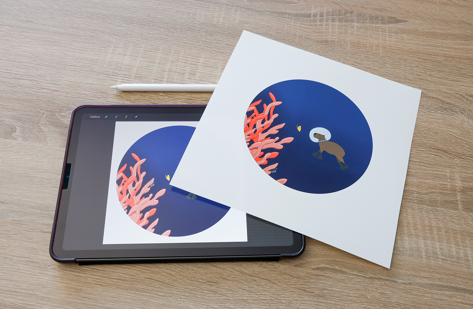
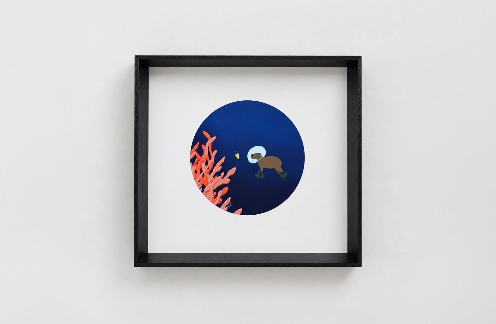
Working in Orms Print Room & Framing, we get to see some of the most incredible artworks come to life, starting as digital sketches on Procreate and ending up as gallery-worthy prints. It’s always exciting when an artist takes that step from screen to paper. But to make sure your artwork truly shines in print, there are a few things you should keep in mind. Here’s what we’ve learned over years of helping artists transform their digital files into tangible pieces.
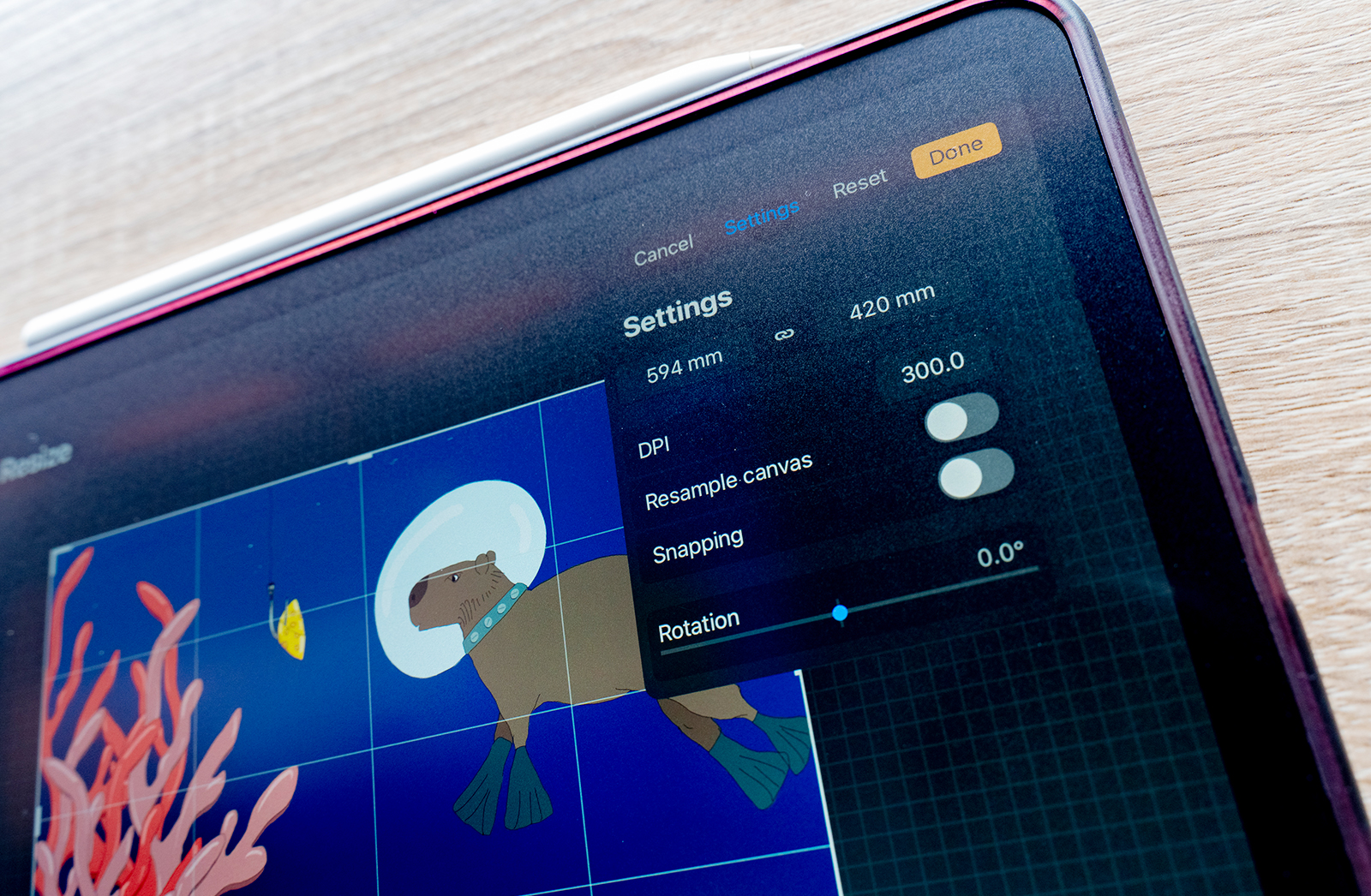
1. Set Up Your Canvas Correctly From the Start
The way you set up your file in Procreate can make or break the print quality.
- Resolution: Always start at 300 DPI that’s the sweet spot for crisp, detailed prints.
- Size: Decide upfront how big you want to print. For example, if you want an A3 print, set it up as 297 x 420mm at 300 DPI.
- Colour Profile: We recommend sRGB. It keeps your colours consistent from screen to print.
2. Work Smart With Brushes and Layers
We see a lot of pixelation issues when brushes aren’t high-resolution. Stick with quality brushes, Procreates library has plenty, and there are amazing third-party ones too.
Layers are your best friend: they give you flexibility to adjust details later without starting over.
3. Think About How Colours Translate
This is one of the biggest surprises for first-time printers. Your iPad is backlit, so colours look brighter than they will on paper.
- Tip: Lower your brightness a touch while working, it helps your eyes adjust.
- Best Practice: Order a test print before going big or running a large print run. That way you can fine-tune colours confidently.
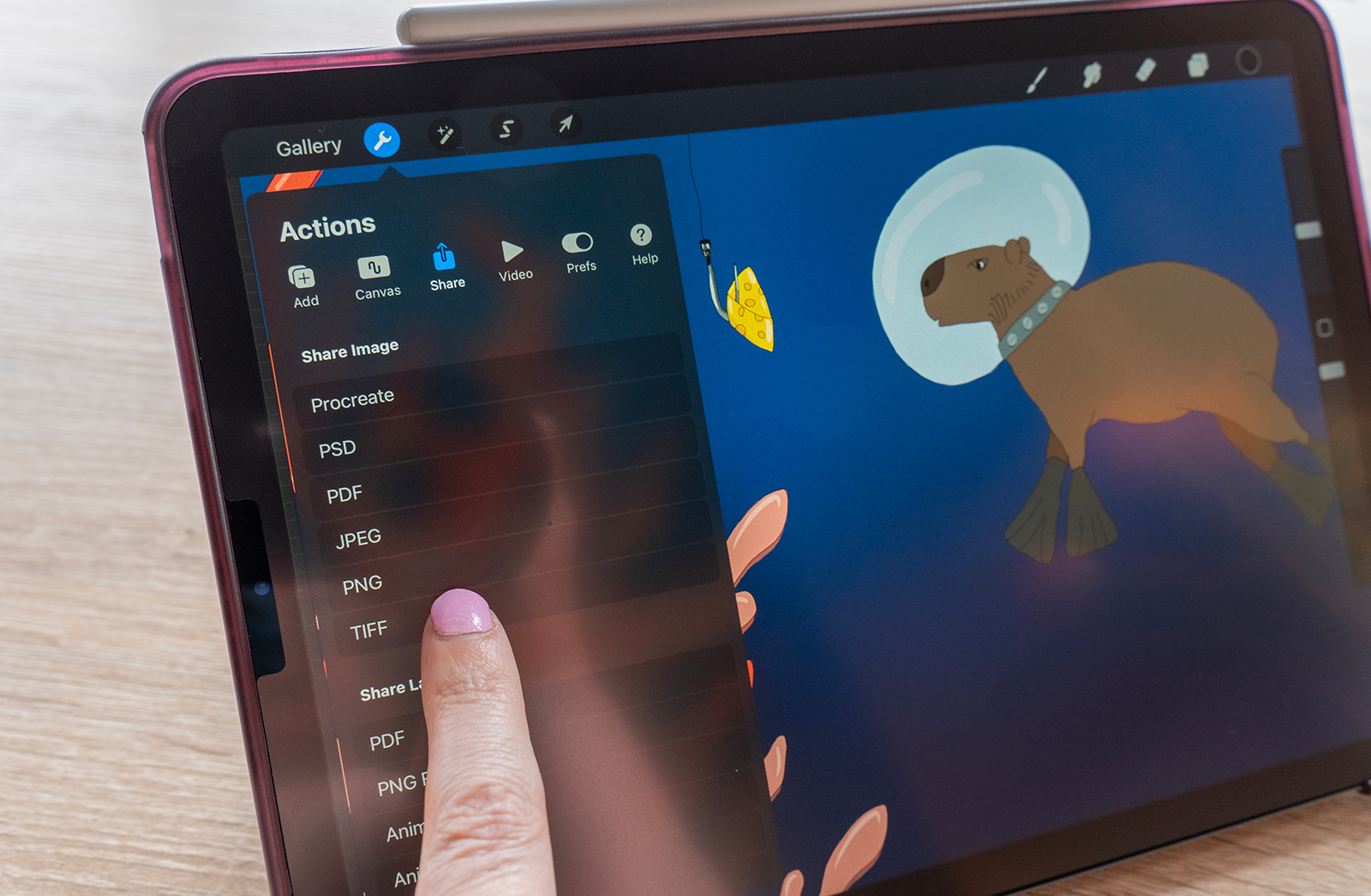
4. Export the Right Way
When your artwork’s ready, export it properly:
- Use TIFF for the cleanest, lossless file.
Keep it at 300 DPI. - Double-check it’s in sRGB.
5. Pick the Perfect Paper or Medium
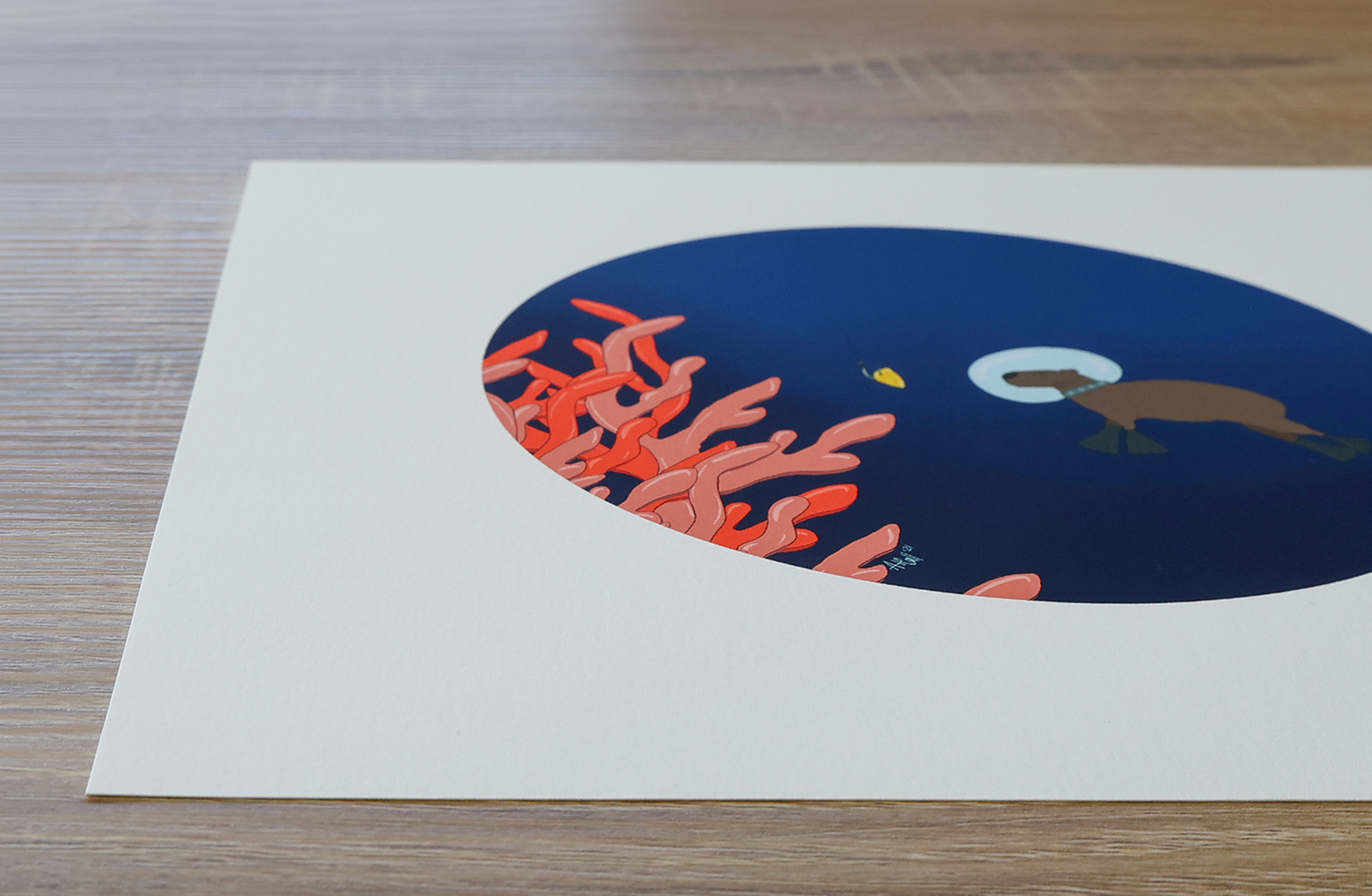
The paper you choose can transform your artwork’s final look.
|
Illustration Style |
Recommended Substrate |
Why It Works Best |
Colour Profile |
Resolution / DPI |
|
Fine linework / digital detail |
Felix Schoeller True Fibre Matt |
Smooth surface keeps lines sharp and colours punchy |
sRGB |
300 DPI |
|
Textured / expressive styles |
Epson Watercolour Hahnemühle Photo Rag/Baryta |
Adds depth and tactile feel; archival quality |
sRGB |
300 DPI |
|
Large-scale illustrations |
Canvas |
Adds presence, texture, and a painted feel |
sRGB |
300 DPI (150 for murals) |
|
Modern, durable finish |
Metal Prints |
Sleek and frameless, great for exhibitions |
sRGB |
300 DPI |
|
Bold, luminous look |
Acrylic / Perspex |
Glossy depth makes colours pop |
sRGB |
300 DPI |
|
Creative textiles |
Fabric |
Perfect for décor, or experimental pieces |
sRGB |
150–300 DPI |
6. Printing Beyond Paper: Acrylic, Metal & Wood
Not all art belongs on paper. Some of the most striking prints we do are on alternative materials that completely change how an artwork feels.
- Perspex (Acrylic): Perfect if you want a luminous, modern look. Colours appear bold and almost backlit, making it a popular choice for contemporary pieces or artworks that need extra visual punch. Hung on a wall, Perspex prints float slightly forward, adding depth and presence.
- Metal (Dibond / Aluminium): If you’re after a sleek, frameless finish, metal is incredible. It’s durable, lightweight, and has a gallery-style presence. The surface gives your artwork a striking, professional edge perfect for exhibitions or statement pieces. When choosing the silver or gold brushed finish, the texture of the metal will be visible in all the white areas of your design or image.
- Wood: Printing on wood adds a warmth and organic quality that paper or metal can’t replicate. The natural grain of the wood interacts with your design, so areas of lighter colour allow the texture to come through. It works beautifully for earthy, textured, or minimalist artworks where the surface becomes part of the art itself.
Exploring these options can give your artwork a second life — sometimes, what looks subtle on paper becomes bold and dynamic on Perspex or metal, while wood can make even digital work feel handcrafted.
7. Final Pro Tips
• Always back up your Procreate files so you can rework or resize them later.
• Don’t be afraid to experiment with different materials, sometimes a texture on the background will surprise you.
• Get feedback from a friend, fellow artist, or even us in Orms Print Room a fresh pair of eyes can make all the difference.
• If you’re not sure what will suit your artwork best, book a consultation with one of us. We love helping artists choose the perfect paper or finish.
Every week we watch artists light up when they see their work printed for the first time it’s something special that a screen just can’t capture. If you’ve been creating on Procreate, don’t let your art stay digital. Print it, frame it, share it, live with it. Trust us your work deserves to exist off the screen.