Blog
Prepare Your Digital Images for Professional Printing
Share this article:
Creating a beautiful image is only part of the process. Whether you’re working with photography, digital illustration or mixed-media artwork, your file still needs to be prepared correctly before it becomes a professional print.
The best print results start with the best possible file. That usually means working from your original image or artwork file, editing carefully, saving an editable master version, and only then cropping, sizing and exporting your final print-ready copy.
1. Start with the highest-quality file
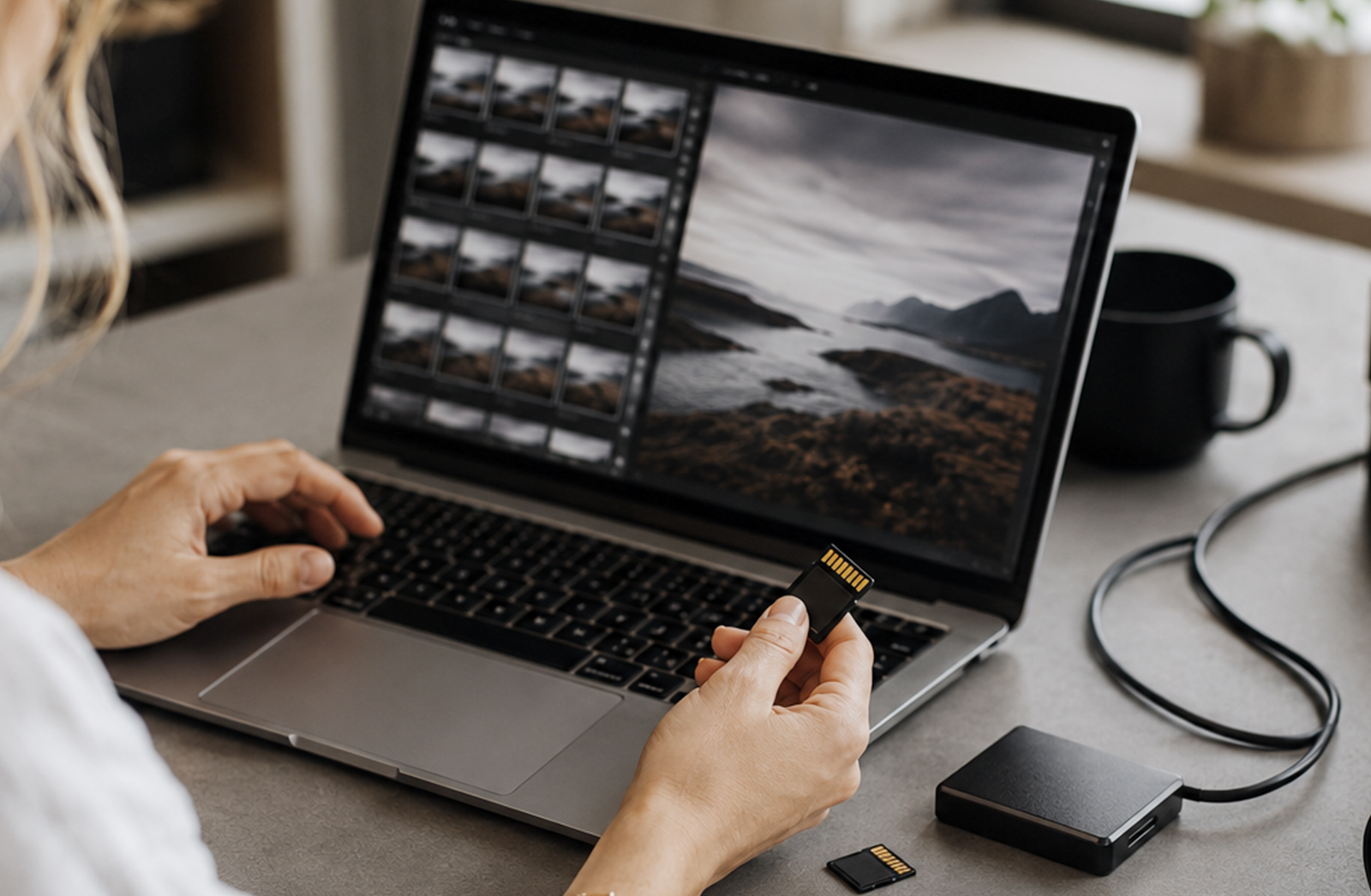
For the best possible print, begin with the highest-quality version of your image or artwork.
For photography, this usually means working from your original RAW file, as it contains more image information than a compressed JPEG. RAW files give you more flexibility when adjusting exposure, highlights, shadows, white balance and colour before preparing the image for print.
For digital artwork or illustration, work from the original high-resolution file wherever possible. Avoid screenshots, WhatsApp images, social media downloads or heavily compressed files, as these often do not hold up well when printed.
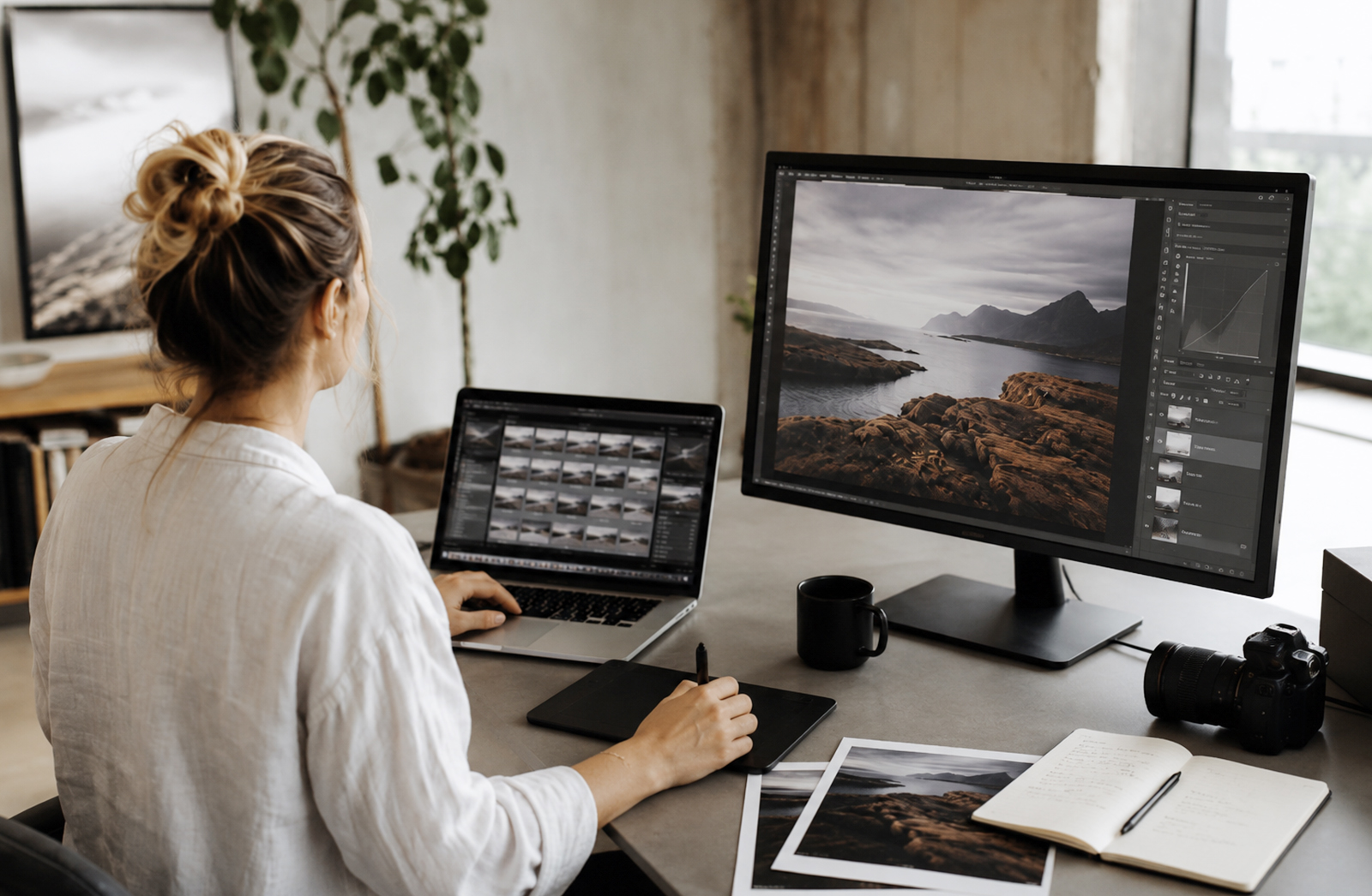
2. Make your first adjustments
Before doing detailed editing, make your basic image adjustments in your preferred editing software. This could be Adobe Camera Raw, Lightroom, Photoshop, Affinity Photo, Capture One, Procreate or another creative program.
This is where you can refine:
Exposure
White balance
Highlights and shadows
Contrast
Lens corrections
Noise reduction
Basic colour balance
Straightening, especially on horizons
Overall composition
The goal is to create a strong, clean base image before moving into more detailed edits.
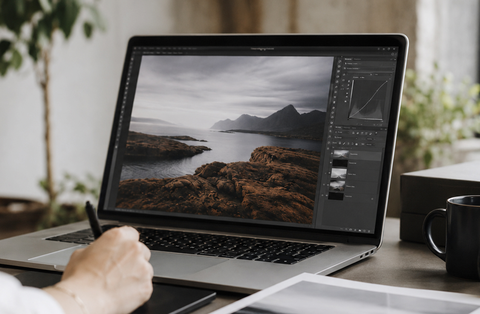
3. Continue with detailed editing
Once your base adjustments are done, you can move into the finer details of your image or artwork.
This is where you can work on:
Retouching
Dust spot removal
Skin or product cleanup
Background adjustments
Compositing
Creative colour grading
Selective sharpening
Local contrast adjustments
Adding or refining design elements
Where possible, avoid flattening your file too early. Working with layers or editable elements gives you more flexibility if you need to make changes later.
4. Save an editable master file
As you work, save an editable master version of your file. This gives you a working version you can return to if you need to adjust colour, retouching, cropping, text or other edits.
A good workflow is:
Original file – untouched source image or artwork
Editable master file – layered or editable working file
Flattened print file -final exported version for printing
Depending on the software you use, your editable master file may be a PSD, TIFF, Affinity file, Procreate file or another layered working document.
Keeping these versions separate helps protect your original image and gives you flexibility if you need to rework, resize or export the file again later.
5. Use non-destructive editing where possible
Non-destructive editing allows you to make changes without permanently altering your original image layer.
Depending on the software, this could include:
Adjustment layers
Masks
Smart objects
Editable filters
Layered effects
Separate colour and contrast adjustments
This makes your workflow more flexible and safer, especially when preparing important images for print.
6. Check the image at 100%
Before cropping or exporting, zoom in to 100% and inspect the image carefully.
Look for:
Soft focus
Pixelation
Retouching marks
Dust spots
Banding in gradients
Over-sharpening
Noise in shadows
Low-resolution added elements
Edges that need cleanup
If a flaw is visible at 100%, there is a good chance it may become noticeable in print.
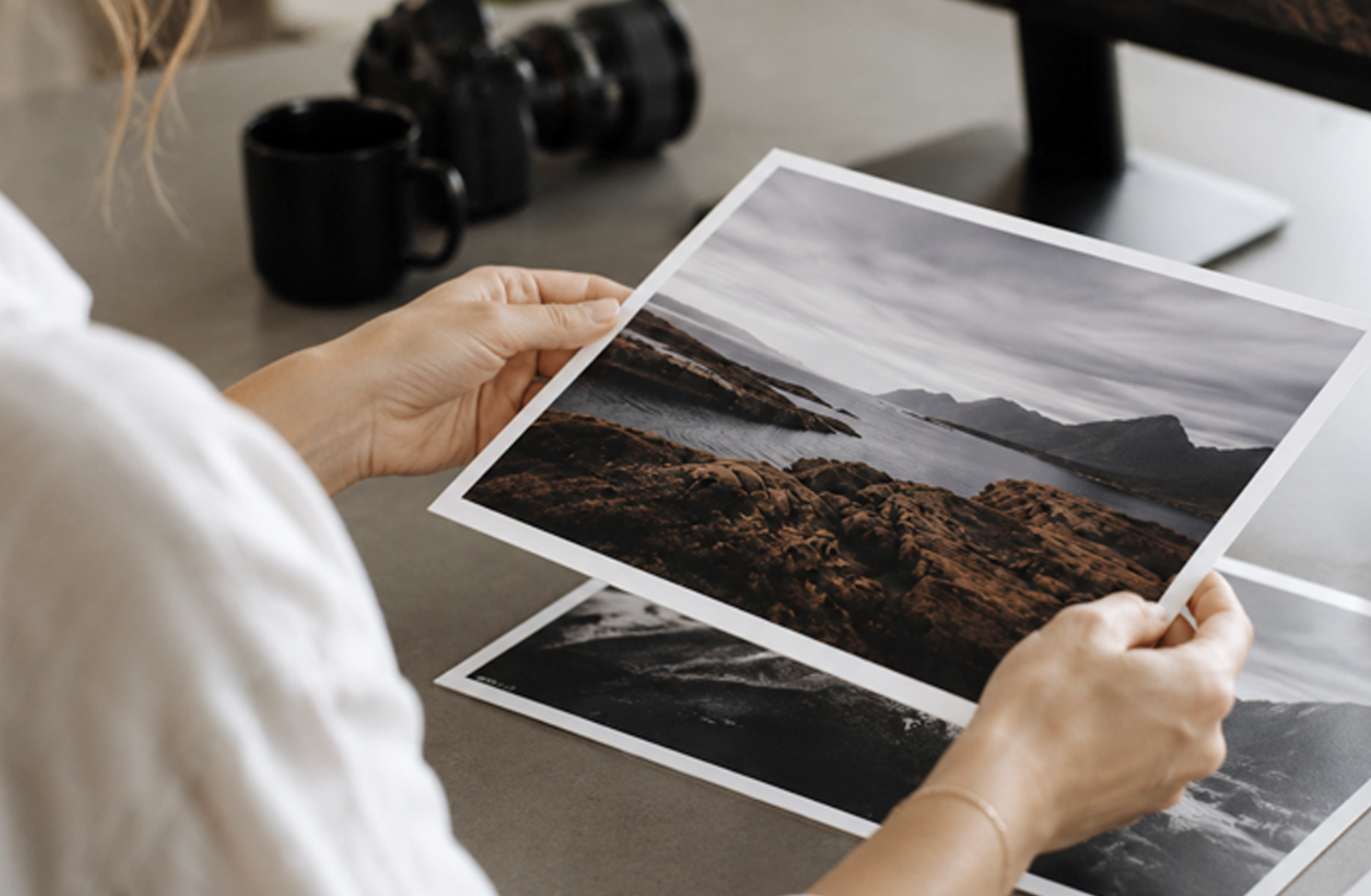
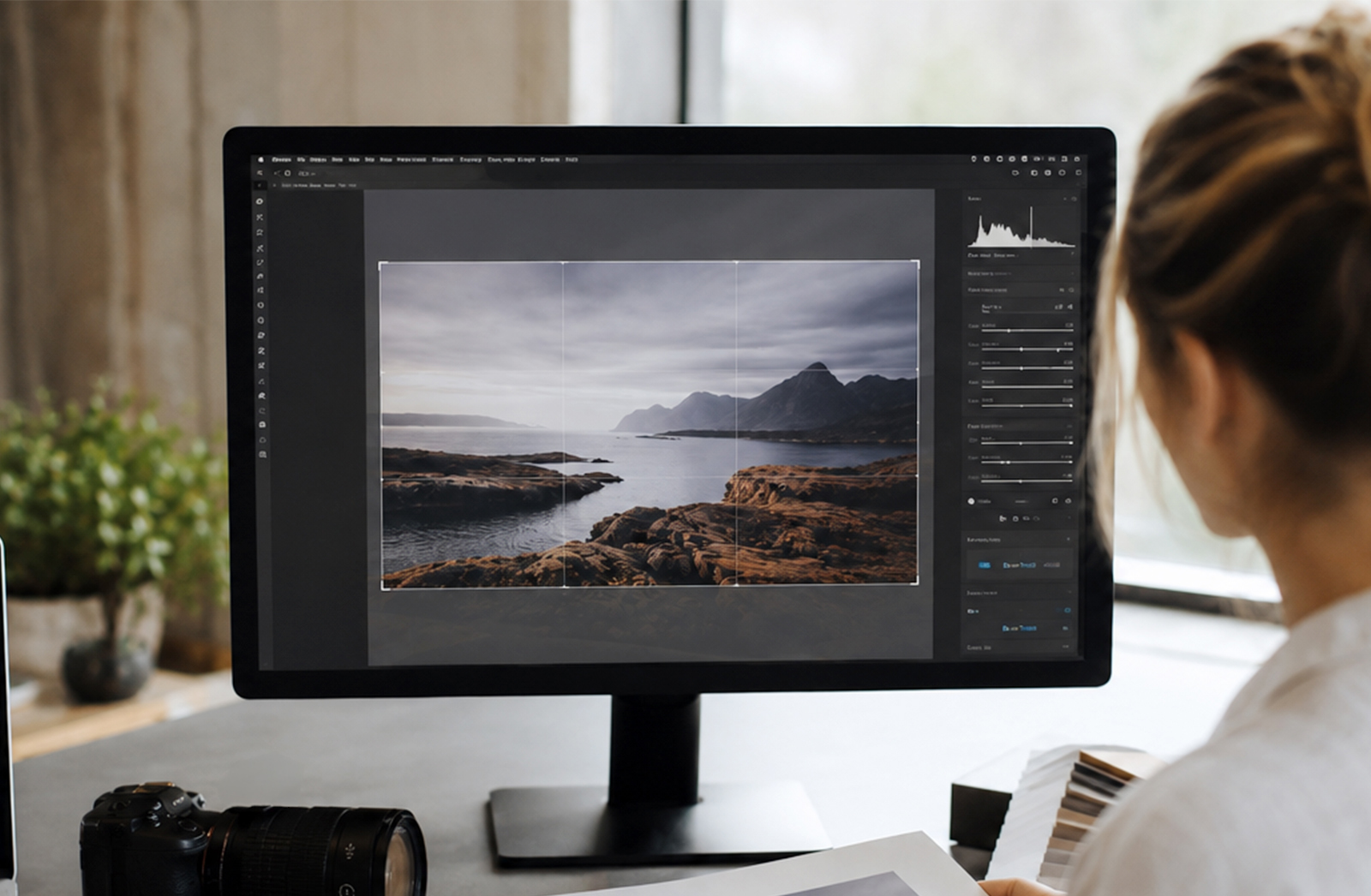
7. Crop to the final print ratio
Once your edit is complete, crop the image to match your intended print size.
This is important because different print sizes use different ratios. For example, a square print, A4 print and panoramic print will all crop the image differently.
Rather than sending a full image and hoping it fits, crop intentionally so you control what stays in the final print.
Examples:
Square print: 1:1
A-series print: A4, A3, A2 etc.
Standard photo print: 2:3 or 4:5, depending on size
Panoramic print: custom wide ratio
Always leave enough breathing room around important details, especially if the image will be framed or mounted.
8. Set the correct resolution for print
After cropping to the correct ratio, check the final image size and resolution.
For high-quality photo and art prints, aim to supply your file at 300 DPI at the final print size. This helps keep detail clean and sharp.
9. Consider brightness and colour for print
Screens are backlit, but paper is not. This means an image that looks bright and vibrant on your screen may print slightly darker or softer.
Before ordering a large print, consider:
Reducing screen brightness while editing
Checking colour on a calibrated monitor
Avoiding overly dark shadows
Ordering a test print
A test print can be especially helpful for exhibition work, fine art prints, portraits, wedding photographs or artwork where colour accuracy is important.
10. Sharpen for the final output
Sharpening should usually happen near the end of the process, after the image has been cropped and sized for print.
Too much sharpening can make skin, skies or soft gradients look overprocessed. The right amount depends on the image, print size and paper type.
11. Export a print-ready copy
Once your image is edited, cropped, sized and checked, export a separate print-ready copy.
For professional printing, good options include:
TIFF for maximum quality
High-quality JPEG for standard photographic prints
Keep a backup of your editable master file safe, and send only the final flattened print version unless otherwise requested. Please note that we can only keep print files for one month.
12. Choose the right paper or finish
The paper or surface you choose can completely change the feel of the final image.
Portraits may suit a soft matt or lustre paper.
Fine art images can work beautifully on cotton rag or textured paper.
Bold, colourful images may suit acrylic, metal or canvas.
Black-and-white photographs often look elegant on fibre-based or matt papers.
The right surface should support the mood of the image, not compete with it.
|
Image Style |
Recommended Substrate |
Why It Works Best |
Colour Profile |
Resolution / DPI |
|
Detailed photographic prints |
Felix Schoeller True Fibre Matt |
Smooth surface keeps detail sharp and colours punchy |
sRGB |
300 DPI |
|
Fine art photography |
Epson Watercolour / Hahnemühle Photo Rag / Baryta |
Adds depth, texture and an archival feel |
sRGB |
300 DPI |
|
Large-format photographic prints |
Canvas |
Adds presence, texture and a softer painterly feel |
sRGB |
300 DPI |
|
Modern, durable finish |
Metal Prints |
Clean, frameless and well suited to exhibitions |
sRGB |
300 DPI |
|
Bold, luminous look |
Acrylic / Perspex |
Glossy depth enhances colour and contrast |
sRGB |
300 DPI |
|
Decorative or experimental prints |
Fabric |
Ideal for décor, textile-based projects or creative applications |
sRGB |
300 DPI |
13. Printing beyond paper: Acrylic, Metal & Wood
Not every image belongs on paper. Some of the most striking prints are created on alternative materials that completely change how an artwork or photograph feels.
Perspex (Acrylic): A great choice for a polished, contemporary finish. The glossy surface enhances colour, contrast and detail, giving your image a vibrant, almost illuminated quality. Mounted slightly away from the wall, Perspex prints create a clean floating effect with added depth and impact.
Metal: Best suited to a clean, modern look with a frameless finish. Durable, lightweight and exhibition-ready, metal gives your image a refined professional edge. With brushed silver or smooth white finishes, any white areas in your design reveal the metal texture beneath, creating a subtle reflective effect.
Wood: Ideal for a warm, organic finish with natural texture. Lighter areas of your image allow the wood grain to show through, giving each print a unique character. This works especially well for minimalist, earthy or textured designs.
Fabric: A versatile option for decorative, tactile or experimental pieces. Printed fabric brings a softer, more textural quality to your image, making it well suited to décor, textile-based projects, banners, displays or creative applications where the printed surface adds to the final look and feel.
Exploring these options can give your image a completely different presence. Sometimes, what looks subtle on paper becomes bold and dynamic on Perspex or Metal, while Wood and Fabric can give digital work a more tactile, handcrafted feel.
14. Final Pro Tips
Always back up your original and editable working files so you can rework or resize them later.
Get feedback from a friend, fellow artist or the team at Orms Print Room & Framing, a fresh pair of eyes can make all the difference.
If you’re not sure what substrate will suit your artwork best, book a consultation with a printing consultant. We would love to help you choose the right paper, size and finish.
Bring your images off-screen and into print. Whether displayed at home, shared as a gift or prepared for exhibition, a well-made print gives your work a lasting physical presence.